 Our Imaging Expert No one can take a picture that everyone likes. But, almost every picture can have scope of improvement. Often, we are not our best critics, while others can immediately point out the faults. In If I were you, our expert comments on how your pictures could be taken to another level.
E-mail your images at sp@nextgenpublishing.net
Rohinton Mehta,
Technical Editor, Smart Photography
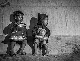
Breakfast Time
Amarjeet Gohain from Assam has sent us this photo, titled ‘Breakfast Time’ by email.
The framing is perfect; the tonality is perfect. Just look at their expressions; God knows what must be going through their little minds. Good use of natural lighting. The background is what looks like the side of a poor person’s hut. At a personal level, I am not in favour of showing powerty but this picture has touched something within me. Good show.
I tried to improve on the contrast but the difference was so negligible that it wouldn’t show in a magazine print.
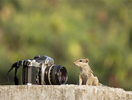
The Squerril
This photo of a squerril comes to us from Saransh Fattepuria via email.
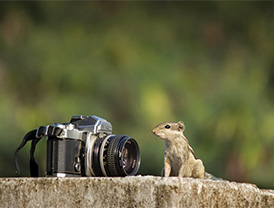
This is a nice picture. It could have been nicer if you had to wait for the squerril to do some antics – like looking into the lens or even looking through the viewfinder (they are known to do that). However, there is no guarantee that the squerril will cooperate. Sometimes, you just have to take what is available.
In the edited photo, I have toned down the wall on which the squerril is sitting since I felt that the light toned wall is begging for attention. I also toned down the squerril (just a wee bit, to get more details). Then I created a vingnette effect so that the viewer’s attention stays on the main subject. Finally, I applied a bit of sharpness to the squerril (not to the entire image).
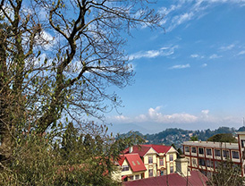
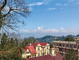
A Darjeeling View
Smart Photography reader Kartick Das has sent us this photo that he has taken during a trip to Darjeeling. He wants my views on how to improve this picture that he has shot using his smartphone.
What is it that prompted you to take this photo? Was it the tree, the sky or the general landscape with the houses in the foreground? I think you wanted to capture the landscape, but by including too much of the sky, the houses at the bottom are chopped off. In my opinion, in this particular case, you should not have cut off the houses in the foreground because they create a ‘base’ for the photo.
Secondly, I feel that the aspect ratio (of 5:4) is not the correct ratio for this image. A 3:2 ratio would have been better. Finally, the tilted structure at the right could have been straightened in postprocessing.
I cannot re-create the cut-off area at the bottom of the frame but please have a look at the markings which will give you some idea of how the composition could have been. |SP

