
Text and photos by Ashok Kandimalla. This article has been modified to make it brief from the original article published in our May 2019 issue.
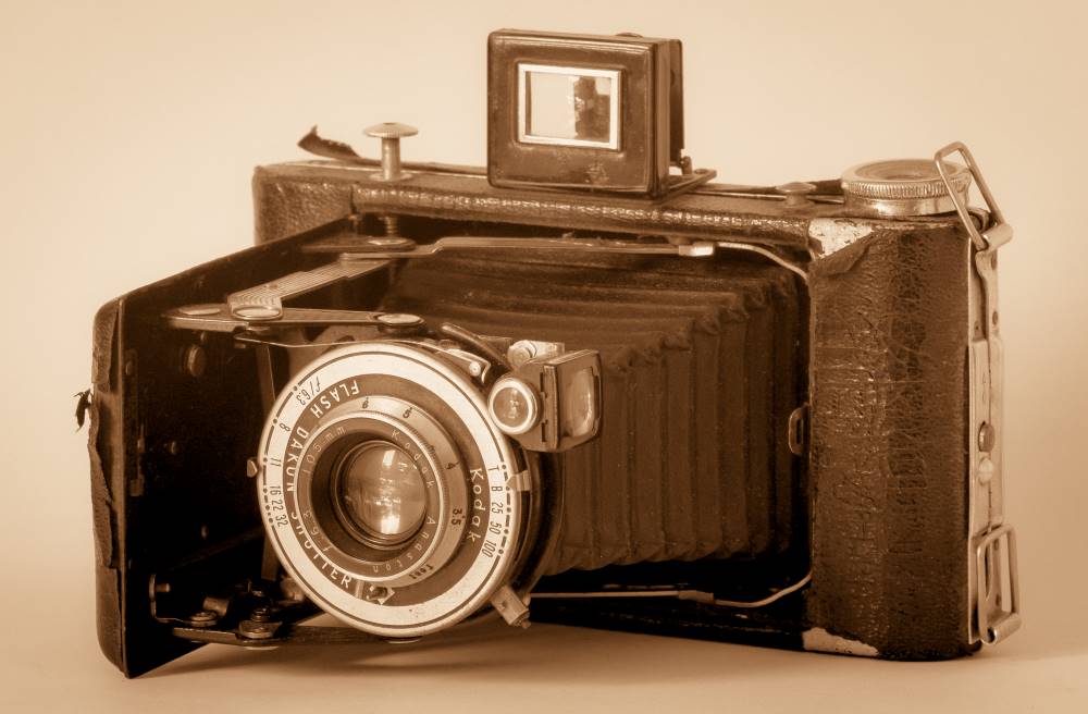
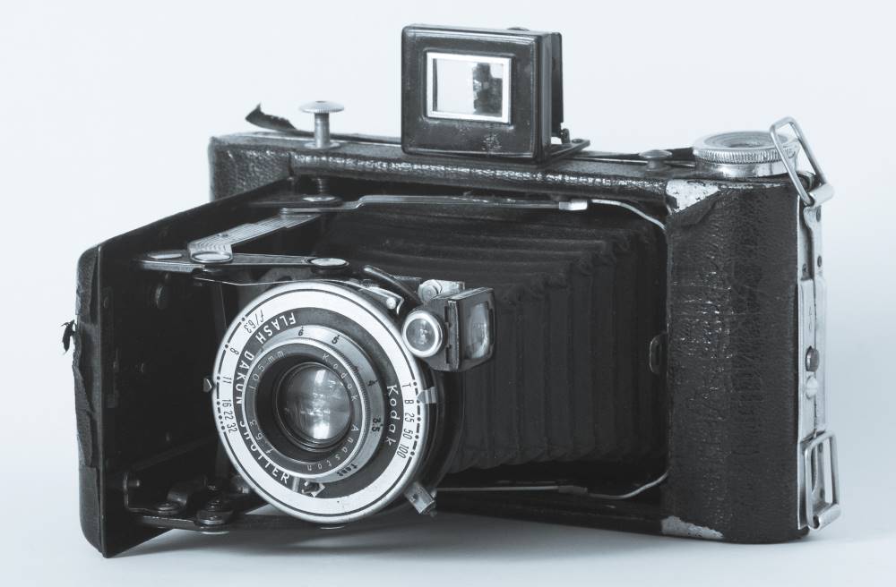
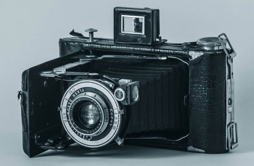
Split toning is a post-processing technique through which you can impart different colours to highlights and shadows. This is a very easy-to-use procedure and when used with moderation (as with any post-processing technique), it gives a subtle effect that is pleasing to the eye. In the digital era, imparting a tone in post-processing is popular to give a ‘vintage’ look to images. For instance, picture 1 shows a normal black and white image. Pictures 2, 3 and 4 show the same image processed with ‘sepia tone’, ‘selenium tone’, and as a ‘cyanotype’, respectively.

In Lightroom, go to the Develop module and from the right panel select the ‘Split Toning’ tool palette (Picture 5). In this palette you will see just five sliders. These are divided into two groups: Highlights (Picture 5ꜜ1) and Shadows (Picture 5ꜜ2). In each group you will see two sliders: Hue and Saturation. The former defines the colour that you want to use for toning, and the latter sets the purity (also called strength) of the effect. There is an alternate way to choose the colour instead, using the Hue slider. You can do this with the two Colour Boxes (Picture 5ꜜ4). Clicking on them will display a pop-up menu with the available colours. You can move the cursor over that box and pick the colour that you want to apply. You can do this independently for highlights and shadows as there are two separate boxes.
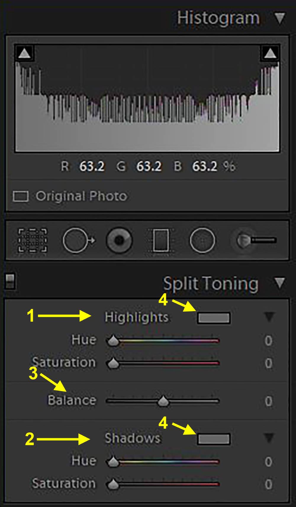
5ꜜ1: Highlights group
5ꜜ2: Shadows group
5ꜜ3: Balance slider
5ꜜ4: Colour boxes
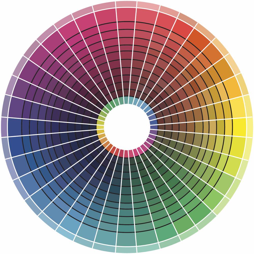
In between the two groups is the Balance slider (Picture 5ꜜ3). Its purpose is to balance the effect between the highlights and the shadows. If you move the slider to the right (that is, positive values), then the effect of Highlights slider is felt more and vice versa. While you can choose any colour for toning the highlights and the shadows, usually photographers use two colours from the opposite side of the colour wheel (Picture 6).
In our example, we will choose orange for highlights and blue for shadows. This is how we apply toning: simply pick from the two colour boxes (Picture 5ꜜ4, top for highlights and bottom for shadows), orange and blue colours. Alternatively, you can also choose the colours by moving the Hue slider in the respective groups.
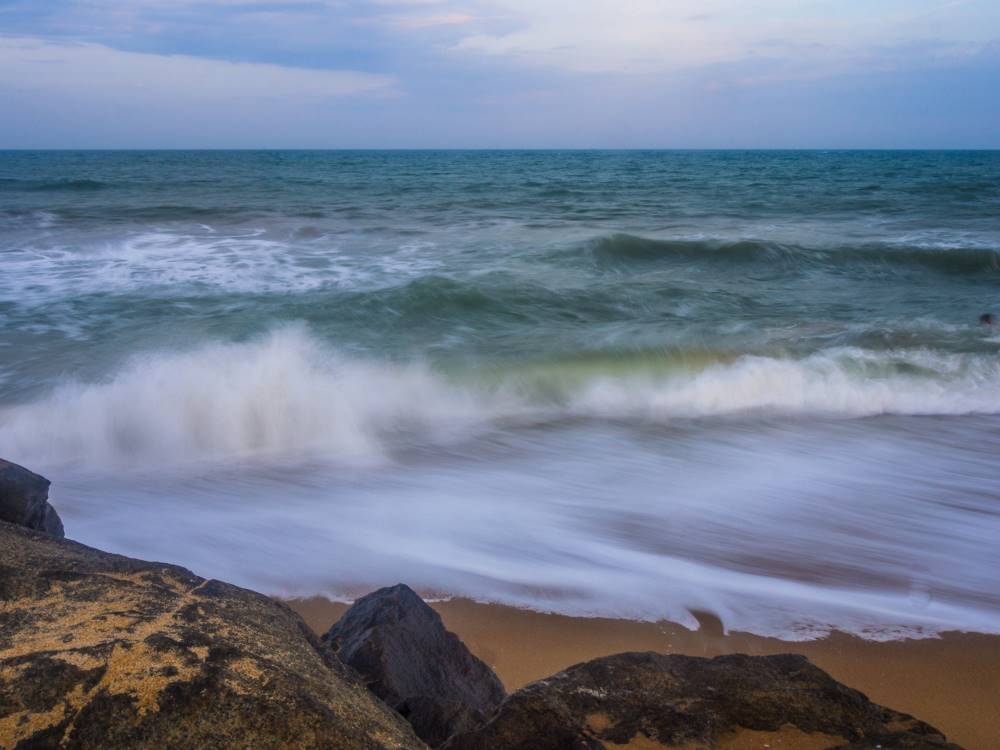
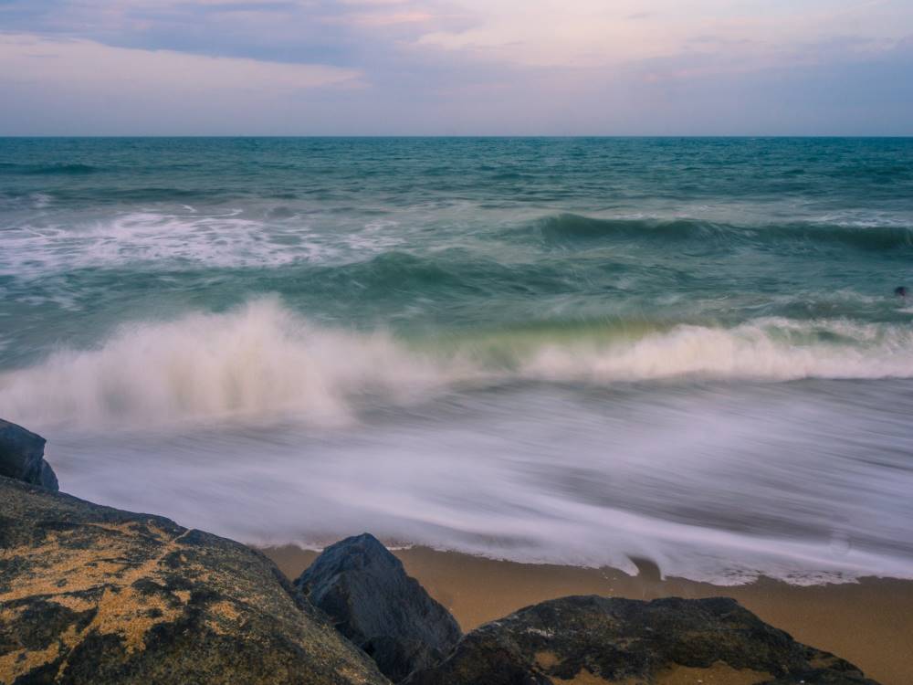
For instance, the image straight from the camera is shown in Picture 7. You can observe that there is some extra blue in the water (highlights). On the other hand, the rocks in the foreground are warmer than needed. This is a good situation where you can apply split toning. The highlights were given warm toning (orange) and shadows were given cold toning (blue). The settings that were used are shown in Picture 8. Picture 8 is the resulting image after the application of split toning.
This is an interesting technique but is seldom used as it is not well known. It is simple to use and produces subtle effects that enhance the image. However, you should exercise some caution and not overdo it.