DY: Are the photographers given freedom while shooting for publications and campaigns?
NFK: In Pakistan, most of the editorial shoots are paid for by the designers themselves. The designer pays and gets the shoot done. They pay to print it in a magazine as a cover or editorial. Magazines also commission their own editorials once in a while but those are usually multi-branded. The publication only has a say or gets involved in shoots that they have commissioned, otherwise the client is the designer with whom we coordinate directly. Most designers allow us complete creative license and freedom. Some approach us with their own concepts as well, which we later tweak.
Campaign shoots are different from editorial shoots, since it involves a textile mill or an overarching brand for which the designer is doing a capsule collection. They are therefore usually less stylistic and experimental; they are geared more towards the business end and are supposed to appeal to the masses. They are generally safer and more focused on being ‘pretty’ than artistic or edgy. Regardless of whether we are shooting editorials or campaigns, we always try to keep the brand-aesthetic in mind while planning the shoot and stay true to that. Each brand has its own unique look and image which is important to represent within the shoot and the concept.
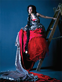
Art Appreciation and Critical Analysis:
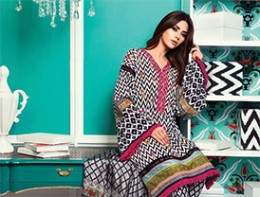
Pic 2 and 3: In pic 2 the model has been well composed amidst patches of two complementary colours – a shade of orange on the top and cobalt blue below. The other primary and secondary colours are in the right position. The yellow patch on the left side of the frame has been balanced well with a hint of yellow on the right. The slight bent given to the neck of the model complements well with the curved stem behind her. A neat hairstyle has completed the shot. The use of patterns from Islamic architecture immediately draws one’s attention and the eye travels over the outfit in a natural way. This entire colour scheme reminds me of the paintings of Paul Gauguin and Henry Matisse – termed as ‘fauvism’ in art. Pic 3 is similar in its visual language but an addition of a tertiary colour- shades of muddy brown and a dull green has added to the beauty of the frame.
Pic4: This picture is a game of pastel shades. The vintage props have made it more interesting. At the same time it is an example of good art direction. If one notices the flooring, the art director and photographer have simply spread a newspaper on the floor. It still works. The hue of the picture is so perfect that it clearly indicates the ‘hand’ of a trained colourist and not just a photo editor.
Pic 5: This once again is a pastel colour scheme. It is certainly not a serious colour scheme but portrays a ‘childish mood’. Along with the perfect styling, it has rightly conveyed the message that even a teenage girl has gone back in time to her childhood days. A nice high-key shot.
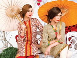
Pic 6: This picture is a nice play of warm colours. The green patch has added a soothing touch.
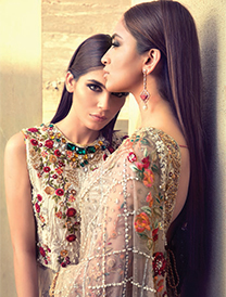
Pic 7: Both the models have been composed very well and carry a neat hairstyle. We see a straight face and an absolute profile. Only the model in front has been given an earring. This has added to the aesthetics of the picture.
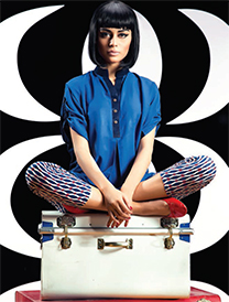
Pic 8: This is a unique symmetric composition. It is largely dominated by primary colours red and blue. The photographer has cleverly broken the symmetry through one-sided lighting, but has added a soft hair-light to bring a separation from the background. He has given an angle to the red trunk kept below. The repetition of the same red shade on the trunk, on her shoes and the nail paint is indeed a mark of NFK. Further, he has created a place for solid white and jet black as a defined ‘colour’ in the picture.
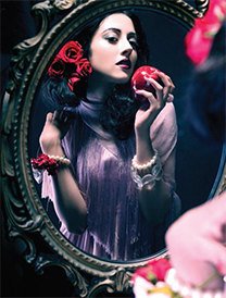
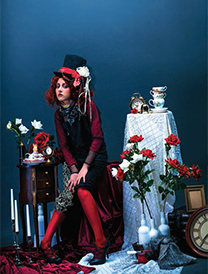
Pic 9, 10, 11: These are examples of brilliant conceptualizations like the use of fairy tales in a fashion feature. These three pictures remind us of childhood stories – Alice in Wonderland, Rapunzel, Snow White and Seven Dwarfs. The photographer and the stylist have worked hard in maintaining a common colour scheme comprising of shades of grey, poster reds and hints of brown.
Pic 12: We again see a fauvist approach in this picture. The frame is dominated by turquoise green. Magenta is a complementary colour to such a colour shade in the colour theory. It has taken the right place in the picture. What I liked is the black and white design pattern present on the dress, which is enlarged and added on the boxes as props in the frame. This has added to the picture.
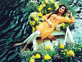
Pic 13: This outdoor shot has been composed well from a slight toppish angle. A vignette of grayish green created by the water waves, the boat painted solid white and the masses of yellow flowers with its complementary shades of violet has given a painting quality to the picture. The model is shown in a relaxed mood hence no accessories have been used. Her bare feet in the water shows that she is really enjoying being there.
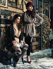
Pic 14: In this picture we can see a very natural soft light falling on the models. It is dominated by an earthy colour scheme and shades from quaternary and tertiary colour schemes. The photographer has not shot the picture head-on, but at an angle. The halffinished log cabin, with pyres of logs piled up behind, the snow having entered the house till that wall, the bust head of a ‘ram’ behind and the skull of some animal at the top of the frame has made it a surrealistic picture to some extent. |SP
Regardless of whether we are shooting editorials or campaigns, we always try to keep the brandaesthetic in mind…

